SaaS Transactional Email Examples and Strategies
Transaction emails are a major opportunity in the SaaS business. These emails tend to have higher open rates than marketing emails. Further, these emails come at a critical moment in your customer’s journey with you. When these emails are fully optimized, they can reduce churn, increase retention and protect your brand.
The purpose of the trial ending emails is simple: encourage a user to sign up for a paid account. Most commonly, this type of email is used for products that have a free trial. Keep the following principles in mind as you create or improve your trial-ending emails.
Use these principles to convert more of your trial-ending emails.
• Send Onboarding Emails Before A Trial Ending Emails. Before a user receives a trial-ending email, they ought to receive onboarding emails. As a brief recap, onboarding emails help the user experience quick wins with your product. In addition, those emails help your user to discover basic features and accomplish tasks. With this ground
• Be Clear About The Deadline. A trial-ending email needs to be crystal clear about the deadline. Instead of stating “your free trial ends today,” be more specific. State that the free trial ends at 11:59 PM PST. Specific deadlines for trial-ending emails are critically important to encourage users to act.
• Use Loss Aversion. Research by behavioral economists indicates that loss is more painful than gain. In short, people are more willing to take action to avoid a loss compared to gain. In the context of the trial-ending emails, emphasize what users will lose when their trial ends. For example, a user might lose access to data in their accounts. When possible, use product data in the trial ending email (e.g., “you will lose access to the 107 contacts saved in your account.”
• Free Trials With Upfront Credit Card: Tell Users They Will Be Charged. If your free trial user must provide a credit card before starting the free trial, avoid charging users without notice. New services such as Privacy.com let consumers easily detect and prevent new credit card charges. Even if customers do not have measures that prevent charges, hitting a customer with a surprise charge is not expected.
• Free Trials Without Upfront Credit Card. You will generally get more sign-ups when you allow people to use the product without providing a credit card. However, conversion to paid accounts tends to be lower. However, there are a few ways to make paying more appealing. For example, you might choose to model ClickFunnels, which has historically bundles of related products such as books and digital training products to drive signups for the core software product. In addition, you can also choose to offer an introductory lower price like Ahrefs, a marketing app, which currently offers a seven-day trial for $7.
• Test and Expand Payment Methods. According to The Motley Fool, the most popular credit card in the United States as of 2018 are Visa, Mastercard, Discover, and American Express. Failing to accept a customer’s credit card can drive customers away. For example, there are several reports on Reddit and other sources where Uber did not accept a customer’s credit card. In one case, a potential Uber customer gave up in frustration and switched to Lyft, a competing service.
Trial Ending Email Case Studies
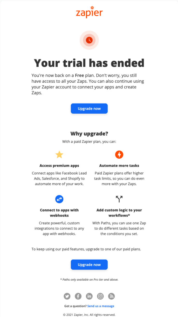
Email Credit: Zapier
Analysis of Zapier’s Email
• Call To Action Clarity. The Zapier email presents a clear “Upgrade now” button at the top and bottom of the email. The button is easy to read and well placed.
• Number of Benefits The email states four clear benefits to upgrading. For example, paid users get increased access to automation. The first bullet (“Access premium apps”) is the strongest because it calls out specific well-known apps such as Facebook Lead Ads, Salesforce, and Shopify.
There are a few ways Zapier could make this email more compelling.
• Increase Specificity In Copy. Three of the four benefits lack specific details. These could be improved by making a promise. Instead of stating “higher task limits,” state the number of tasks one can perform with a task.
• Add Personalization. The email lacks personalization details. This could be improved by referencing the customer’s usage (e.g., “we hope you’re enjoying your Salesforce automation”).
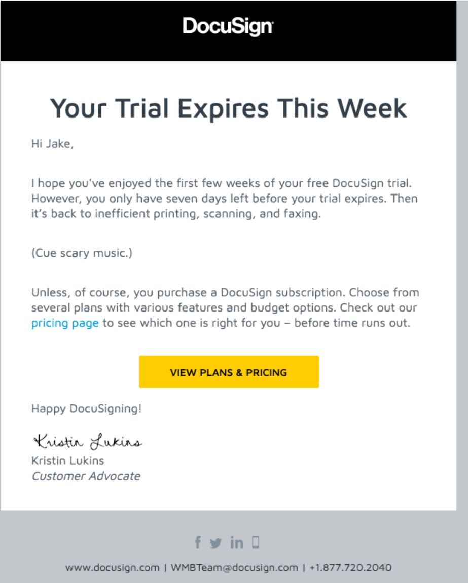
Email Credit: DocuSign
Analysis of DocuSign’s Email
DocuSign’s email is a traditional email with a touch of flair.
• Deadline. The email states a deadline to take action: “you only have seven days left before your trial expires.”
• The Pain of Inaction. DocuSign’s email does well in hitting on the pain of failing to sign up for a paid plan. The user will have to go back to “inefficient printing, scanning and faxing.” My favorite part of the email is the playful touch: “(Cue scary music.)”
• Personal Sign Off. Unlike most SaaS emails, DocuSign does something different at the end of their message. The message has a sign-off by a specific, named Customer Advocate at the company. That approach may encourage users to reply to ask questions and allow DocuSign to help customers sign up.
DocuSign’s email is relatively generic, so that it can be improved in a few ways.
• Reference Product Usage. The email does not refer to any kind of product usage. At a minimum, it would be better to segment users into two categories: zero product usage and some product usage. Zero product usage recipients should receive different emails to encourage them to use the product.
• Vague Call To Action.. The main focus of the email is on a single call to action: “View Plans & Pricing.” It would be better to reference a price or a specific feature. For example, the Business Pro plan gives users the ability to collect payments. That’s a more exciting feature than collecting signatures alone!
End of Free Trial Email
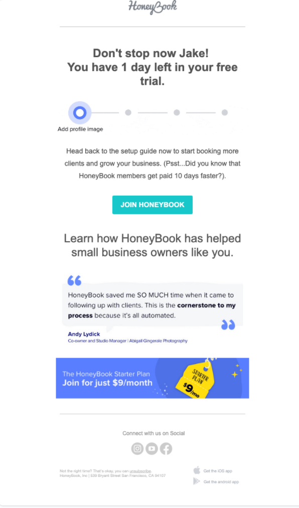
Email Credit: HoneyBook
Analysis of HoneyBook’s End of Free Trial
HoneyBook’s free trial ending email is one of the best I’ve seen on the market.
• Deadline The email clearly states that the user has one day left in their free trial.
• Personalization The HoneyBook email addresses the user by the first name in the first sentence of the email. It also appears that the email is personalized based on the user’s product interaction (i.e., signaling that the next step is “Add profile image”).
• Social Proof. The email includes social proof in the form of a quote from a specific customer (i.e., studio manager of a photography studio).
There are a few ways HoneyBook could make their email better.
• Improve The Quality of Social Proof. The testimonial quote is good, but it could be even better. I would recommend including a small headshot photo of the customer and their location (city, state). These added details make the testimonial even more effective.
• The pain of Inaction. It is unclear exactly what happens if the customer ignores this email. Do they continue to have access to the product with a free plan? Or do they lose access completely? Reviewing the HoneyBook pricing page, it looks like there is no free plan. In that case, it may be worth selling harder
• Test The Get Paid Faster Angle Right above the “Join HoneyBook” button, we read that HoneyBook members get paid ten days faster. That benefit could be pretty compelling to a business owner struggling with cash flow. Therefore, consider emphasizing that benefit. For instance, “Most HoneyBook customers get paid ten days faster. If you want to get paid faster, sign up for the HoneyBook starter plan by clicking here.”)
Many companies offer their product at two, three, or more price points in the SaaS world. For example, a new user might start with a free account and then upgrade to a professional account. However, your goal might be to move users to your top-tier account to provide more value.
• Customize The Email To The User’s Current Account. Tailoring your upgrade email to the user’s specific account makes the email more relevant. For example, consider offering an inexpensive plan to a free user. On the other hand, you might offer an enterprise plan to users who have fully utilized the capabilities of an entry-level plan. This principle is less significant for a small company with two plans – a free and paid account. As companies introduce more complex options, customization becomes more critical.
• Focus On A Few Key Differences Between Plans. Your account plans might have a dozen differences in terms of features, integrations, and more. It is easy to get overly excited about all of the features you have created. It is best to choose a handful of differences between plans that are easy to understand. For example, if the top plan includes unlimited usage, make that plan easy to see.
• Sell Higher Priced Plans With Services. Most of the world’s largest B2B software companies earn a significant amount of their revenue from professional services. In Q4 2021, Oracle earned over $800 million from services (i.e., 7% of total revenue came from services). Some SaaS founders and investors avoid professional services because they are labor-intensive – you need expert-level employees for fulfillment. However, offering these services can make your product much more attractive to sophisticated business customers. Offering some kind of service package at your higher-priced services is one way to make your high-tier services.
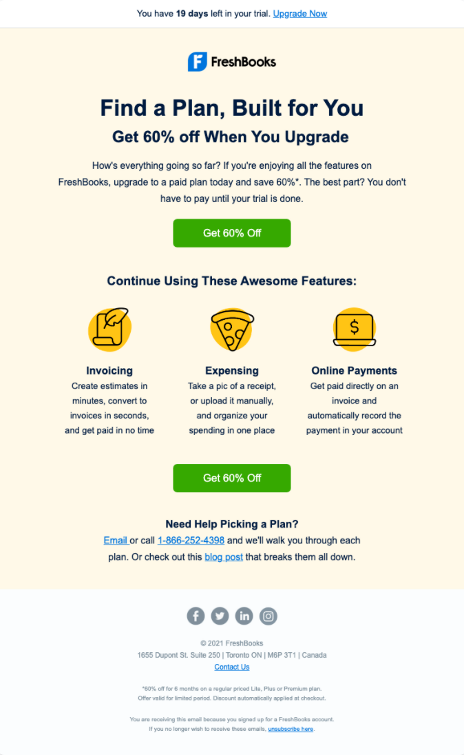
Email Credit: Freshbooks
Freshbooks is taking a tried and tested approach to this email: offering a discount.
• Discount Offer. Offering customers a deal to act now is a proven way to prompt action. The offer is also hard to miss: it is repeated four times in the email. Stating your offer multiple times in an email can work.
• Focus On Three Features. In addition to offering a discount, the Freshbooks email focuses on three specific features. In reality, Freshbooks can do much more than those three features. The icons - especially the pizza one for expenses - add a touch of fun.
Making accounting software compelling is no easy task. However, there are a few ways that Freshbooks could make their email more compelling..
• Add A Clear Deadline. In the small print at the bottom of the email, you will see the phrase “Offer valid for limited period.” It is unclear what limited period means. Admittedly, keeping the deadline vague makes it easy to reuse the email without changes. However, busy business owners may be more likely to take action if there is a clear deadline (“Offer expires in 5 days”)
• Invoicing Bullet.. This bullet could be rephrased to emphasize the benefit. It is unclear what “get paid in no time” means. It would be more compelling to state something like “80% of Freshbooks invoices are paid within 48 hours.”
You might be wondering why we are covering receipt emails in detail. After all, a receipt simply tells the user what they have paid. Receipt emails are special because business users almost always read these emails in detail. Use these tips to make the most of every receipt email.
• Accuracy and Timeliness. Providing accurate receipt data is the primary goal of receipt emails. That means the price listed in the receipt email matches the amount charged to the customer and the currency charged. Receipt emails should be sent shortly before the charge is applied to the customer’s account. Some customers might prefer to receive invoices in PDF files or other formats. In that case,
• Taxes. In 2019, Fortune reported that several technology companies, including Amazon, Netflix, and Microsoft, used legal loopholes to avoid paying up to $100 billion in taxes. While legal, this type of tax strategy can attract negative publicity. Therefore, take care to accurately calculate taxes charged to customers are correctly stated on all receipt emails.
• Add Something Special. The first two requirements are essential, and customers expect you to follow them at all times. The third principle is to offer something remarkable in your emails. For example, e-commerce company CD Baby created a humorous email that lavished praise on customers. Alternately, a receipt email might include a link to new product announcements or an upcoming event. If you use this “something special” method, make sure you offer a clean copy of the receipt information in a PDF or account portal.
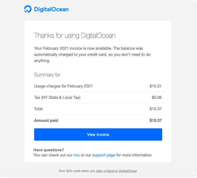
Email Credit: Digital Ocean
DigitalOcean provides a simple receipt email that gets all the basics right.
• Personalized. The original email above included the customer’s name in the “Summary For” line. This has been removed from the screenshot to protect privacy. Failing to address a customer by name may create the perception that the email is spam or fraudulent.
• Invoice Charge Breakdown. The email clearly distinguishes between the base charge, taxes, and the grand total.
There are two minor ways DigitalOcean can improve their email.
• Clarify Payment Details. The email states that “the balance was automatically charged to your credit card.” A business user might have multiple credit cards. Therefore, it would be more effective to state “credit card ending in 1234.” In addition, the email could be improved by stating when precisely the charge was applied.
• Emphasize The Referral Offer. At the very bottom of the email, there is a small, difficult-to-read copy encouraging the recipient to earn a $25 credit. This offer is sound, but it is difficult to read. I suggest moving the $25 referral offer further up in the email, right after the “Have Questions?” section.
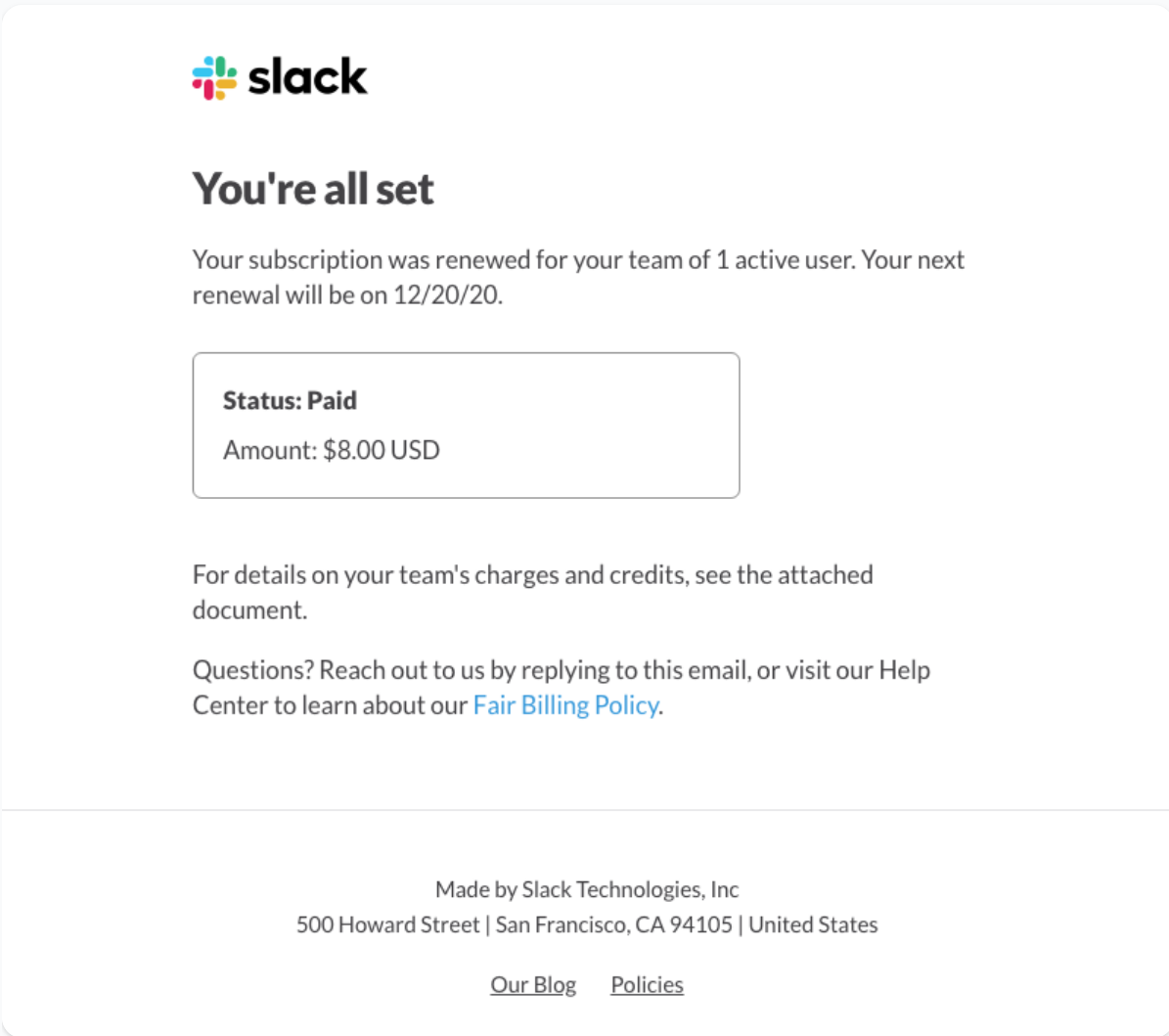
Email Credit: Slack
Slack’s receipt email is simple and to the point.
• Payment Details. The email provides the basic payment details: amount paid, payment status (“paid”), and a number of users (i.e., one user).
Slack’s receipt email could be a lot better.
• Provide Tax Information. In contrast to Digital Ocean, Slack does not state a tax breakdown in the email itself. This lack of information may cause the user to search for information in the attachment or the website.
• Make An Offer. Slack’s receipt email makes no offer of any kind. Given that Slack is a collaborative tool, the most obvious offer would be to invite another user. After all, a collaboration app with just one user isn’t going to be that useful. At a minimum, it would be wise for Slack to set an internal rule for receipt emails - if there is only one active user on an account, engage with that prospect to get more users signed up.
All good things come to an end, including your relationships with customers. Thoughtfully crafting a cancellation email is essential for a few reasons. It allows you to protect your brand and provide good customer service. Further, a cancellation email is an opportunity to understand customer behavior better so you can retain other customers.
• Confirm The Cancellation. Start by confirming the customer’s account has been canceled. This information needs to be straightforward to understand. In addition, state the date the customer’s account access will end. In addition, make it easy for the customer to export their account data to move on. Keeping a customer’s data hostage will only generate ill will.
• Ask For Feedback. When a customer decides to cancel their account, you have an opportunity to learn. There are a few ways to seek feedback: a link to a survey, reaching out to a customer by phone, or asking them to reply to the email. If you hear ten customers in a row complain about poor security or a broken integration, then you know what you need to do to improve.
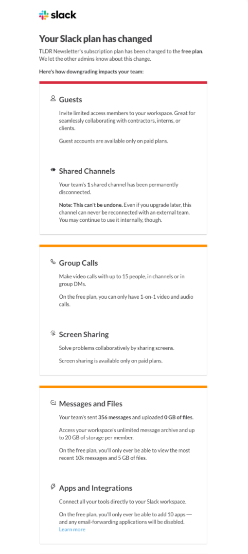
Email Credit: Slack
Slack’s cancellation email is one of the longest and most detailed we have considered in this ebook so far. Let’s take a closer look at what the company is doing well.
• Personalization By Product Usage. The email has one product usage comment: "your team's sent 356 messages and uploaded 0 GB of files." These specific details subtly indicate the value the customer has experienced with the product.
• Feature Change. In this specific case, the customer has downgraded from a paid plan to a free plan. As a result, the customer loses access to various features like screen sharing and integration limits.
There are a few opportunities for Slack to make their cancellation email more robust.
• Shorten The Email. The email strikes the user as somewhat overwhelming compared to other emails covered here. The first recommendation would be to select two or three specific changes. For example, keep references to features that the customer has used.
• Mixed Messages About Replies. This email is sent from a “no-reply” email address. Yet, the bottom of the email states, "simply reply to this email, and someone will be happy to help you." If you want users to reply to you, avoid using “no-reply” email addresses.
• Use Loss Aversion More Strongly. The email generally takes a loss-aversion approach by stating that the user will lose access to features. However, the loss is somewhat vague. For instance, paid plans include custom "retention settings" for messages and files. It is implied that free plan users will see their content automatically deleted. It would be more compelling to state something like “messages and content on free plans are deleted after 90 days.” Seeing that information may motivate more users to upgrade back to a paid plan.
Optimizing SaaS transactional emails are a significant opportunity for quick wins. The recipients already know about your product and trust you to a degree. For products with a free trial option, applying loss aversion and deadline pressure are some of the best ways to prompt people to act. The Zapier trial-ending email case study used a two-column design to present four benefits to users who upgrade to a paid account. The Freshbooks trial ending email adds a touch of playfulness (pizza is a business expense!) while giving users a discount offer (60% off) as an incentive to upgrade immediately.
When it comes to receipt emails, it is helpful to think of these as having two layers. The first layer communicates receipt details like the amount paid, subscription status (i.e., paid), and taxes. Ideally, these emails will also provide an easy way to download invoices or receipts as a PDF. The second layer for receipt emails is optional - making an offer. For example, you can invite customers to an event, announce a new feature, or share links to new content you have published.
Cancellation emails tend to be an afterthought because there is not much to be gained. The customer just wants out of their plan, right? Not quite. Similar to a receipt email, there are two aspects to creating these emails. First, it is essential to confirm that the customer's cancellation account has been accepted. If applicable, advise them what happens to data in their account (e.g., does it get automatically deleted after 30 days)? Second, keep the door open for canceled users to come back. For example, Slack allows users on paid plans to shift to a free plan. The free plan gives users some value but is subject to significant limits. By keeping the user engaged as a free user, Slack has additional opportunities to keep marketing their paid plan.
For more welcome email templates, check out the Transactional Email Templates section of SaaS Email Templates!

I am the founder and CEO of Messaged, the email marketing automation platform built for SaaS companies.
My email is [email protected] and I am @tldrdan on Twitter; if you have specific feedback or questions related to this guide, I would love to hear from you!
Email Marketing Automation for SaaS Businesses
Start your 14-day free trial or contact sales to book a free demo. Start growing your SaaS business today!